
There are a few basic rules in flower arranging that should be observed.
Once you understand these you can create so many different styles and your floral designs will have that professional look.
The basic rules of flower arranging include
- Proportion
- Balance
- Harmony
- Rhythm
- Colour
- Texture
Proportion
The size of the flowers, foliage and container should all be in proportion to each other.
For example, a tall arrangement of long stemmed roses would be out of proportion arranged in a small vase. It would not only look top-heavy, it would be in danger of toppling over.
At the opposite end of the scale short-stemmed flowers should not be placed in a large urn.
An arrangement should also be in proportion to the surroundings. A small posy suitable for a coffee table would be lost in a large reception room.
Churches and hotel foyers need large arrangements in keeping with their larger than usual surroundings.
Balance
When correct balance is achieved, an arrangement looks “right.” If it is not balanced it is like seeing a picture hanging crookedly, you feel uneasy and you immediately want to straighten it.
The height of the arrangement should be at least one and a half times the height of the container.
For example if a container is 25cm tall then the height of the arrangement should be at least 37cm high.
An arrangement can be much higher than this, but for correct balance it should not be lower.
Harmony
The materials such as flowers, foliage, colour, container and any accessories used in an arrangement should all look as if they belong together.
Rhythm
With a flower arrangement the eye should be initially attracted to the overall design and then move from flower to flower. It should flow so it appears natural and not be stiff.
Flower heads should be on different levels. Flowers all placed on the one level will look dull and uninteresting.
Aim for a three-dimensional look in your designs. This enables the eye to travel from the largest feature flowers in the centre, through to the medium sized flowers, and then to the smallest flowers or buds that are placed around the edges.
Colour
The choice of colour should be chosen to suit the occasion and the surroundings
Certain colours complement each other.
Yellow is the colour of the sun and is bright and cheerful.
Blue and green are cool and soothing.
Pink is feminine and uplifting.
Orange and gold are warm and mellow.
Red is associated with love and is vibrant and exciting.
Purple is a symbol of royalty and is rich and dramatic.
Texture
Flowers and foliage differ in texture. You should use different textures that go well together to give variety to your designs.
Follow your passion and become involved in the wonderful world of floristry
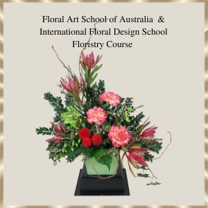
Floral Art School of Australia and International Floral Design School
For full information about the Floristry Course Please CLICK HERE
If you have any questions about the floristry course please contact us – we are here to help
Email: info@floral-art-school.com.au
Phone: 03 85559774
Warm Regards
Fay Chamoun
Floral Art School of Australia and
International Floral Design School
www.floral-art-school.com.au